
Day 15
Integrating Objects into Your Applications
The first day of the third week begins with a lesson packed with information and hands-on development. On Day 13, "Interacting with Objects and ActiveX Controls," you got an in-depth overview of objects and controls. Today's lesson continues with that topic and teaches you how to apply the concepts you learned on Day 13.
Java applets and ActiveX controls are two of the most exciting and popular object types on the Internet market today. You can use Java applets to extend your application's functionality, and you can either use pre-defined Java applets or build your own custom applets. With ActiveX controls, you can improve your application's appearance and performance and make user interaction and communication much easier. This lesson covers both Java and ActiveX objects and demonstrates how to integrate Java applets and ActiveX controls into your applications. After today's lesson, you should understand how to take advantage of the power and capabilities of these objects.
First, the lesson compares the strengths, benefits, weaknesses, and differences of Java applets and ActiveX controls. You should get a feel for when and why to use each object. The next two sections demonstrate how to insert Java applets and ActiveX controls into your applications. Most of today's lesson is focused on ActiveX controls and VBScript examples, but the concepts apply to Java applets, too. You learn how to manipulate the properties and methods of ActiveX controls to affect their behavior. The final lesson for the day explains how the Visual InterDev Script Wizard can make your development efforts easier. You can use the Script Wizard to easily incorporate scripting logic into your application and extend the functionality of your objects and controls.
By the third week of this book, you're probably recognizing a pattern to these lessons. Each lesson is designed to teach you the hard way to perform some task. After you persevere and learn the nuts and bolts of the process, the lesson teaches you an easier way to get the task done by using a key Visual InterDev feature. That doesn't mean you can take the easy road and immediately skip to the end of the lesson. In my experience, it's better to understand the inner workings of something before you move on to a more simplified approach. Using that training approach in this book helps you understand and appreciate what the Visual InterDev feature does behind the scenes. You will then have the knowledge you need to customize and extend the feature.
ActiveX Versus Java
The title of this section began gracing the covers of many magazines during 1996. The Internet community has also been engaged in this discussion. On the one hand, you have a faction who thinks of Microsoft as the evil empire, referring to ActiveX as "CaptiveX" because it supposedly imprisons people in the "Wintel" dungeon. There is another group who denies these accusations and speaks of Java with demeaning names, such as "ReactiveX." This community of dissenters feels that Sun Microsystems is trying to revise Java as a reaction to the power of ActiveX technology.
I imagine the debate will continue over the next few years, and the battle won't stop until some writer declares victory. Who wins in this relentless pursuit for the prize? Actually, it's the developer. Although pitting these technologies against each other makes for nice headlines and supplies topics for water cooler debates, you will probably use both of these technologies to develop your Web-based application. Both Java applets and ActiveX controls have a place and purpose in your application. Each technology offers important benefits that I'll highlight in today's lesson.
Exploring the Qualities of ActiveX
ActiveX controls, which enable you to construct interactive Web-based applications, have two main strengths. First, there are many different types of ActiveX controls that give you unique, effective ways to distribute and gather information from the user. These controls range from standard GUI controls, such as the push button and entry field, to the more robust Web-based controls, such as the Marquee control. You can use these ActiveX controls to create an effective user interface and metaphor for your application. ActiveX controls offer more robust objects and features than intrinsic HTML controls, which are somewhat limited in capabilities.
The second main advantage of ActiveX controls is their ability to integrate with other components on the desktop and the server. This feature can also be a disadvantage, as I will discuss in the next section, "Examining the Drawbacks of ActiveX." Since ActiveX controls are built by using Microsoft's Component Object Model (COM), you can integrate the controls with other components, such as a Microsoft Word document, Excel spreadsheet, or any other component that supports COM. This feature opens up new possibilities when you're designing your Web-based application.
Many people are converting their document information produced with proprietary software to the open HTML format for publishing on the Web. With ActiveX controls, you can integrate these documents into your application and avoid the conversion process. Much as you can embed a spreadsheet into a Word document by using Object Linking and Embedding (OLE), ActiveX controls give you a new model with less overhead to do the same task. You don't have to convert all the proprietary information. Instead, you can use ActiveX to embed this information into your Web-based application. The browser remains the universal client for your application. Your application interface incorporates the COM object into the web page, enabling the user to interact with the spreadsheet, graph, or document within the browser. These features also apply to the server, as you will discover in the lesson on Day 17, "Using Active Server Components to Create Multitier Applications."
Examining the Drawbacks of ActiveX
As already stated, one of the main benefits of ActiveX is also a potential disadvantage. The ability of ActiveX controls to interact with the file system and other components on the client and server machines is a potential security hazard for untrustworthy controls. You probably thought the concept of trust could be shared only among animate objects, but ActiveX controls can and do incorporate trust into their relationship with an application.
ActiveX controls rely on services that verify the reliability, or trustworthiness, of the control. Trust verification services make sure the control can be trusted to provide certain functions, which are verified by a neutral third-party trust administrator, based on the "blessing" of a trust authority. Trust authorities maintain policies for authenticating a control. For example, a trust administrator verifies that a company's ActiveX control can be trusted to perform a certain function. Based on this blessing, the browser can download the ActiveX control with the assurance that it won't engage in some harmful activity, such as corrupting your file system.
With Microsoft's Internet Explorer, you can set specific levels of Internet security for downloading ActiveX controls as an additional safeguard. Trust verification is a fairly reliable safeguard to ensure the reliability of ActiveX controls; however, it's not airtight and could result in a corrupt ActiveX control being downloaded to your system. If an untrustworthy ActiveX control masks its way through the process, the potential damage can be disastrous, but the reliability of the verification process makes the chance of this happening very slim.
Another drawback of using ActiveX controls is that they're targeted toward the Microsoft Windows platform, which can be a disadvantage if your application is going to be used across multiple platforms. Microsoft has transferred the ActiveX specifications to the Open Group in an effort to make the technology more acceptable and compatible across multiple platforms. The Open Group will provide an impartial consortium of vendors to oversee the expansion of the ActiveX technology and help address the cross-platform issues surrounding ActiveX controls.
Exploring the Qualities of Java
Java offers the promise of a true cross-platform development language, and to some, Java even represents a way of life. Developers have embraced Java as the Holy Grail and become as dependent on it as their morning cup of coffee. Some are going so far as to say that Java should be the universal language for everything, including your operating system, your spreadsheet and word processing software, and your car's engine. Two main advantages of Java are its support for multiple platforms and its security. Java's multiple-platform support includes Microsoft Windows, Apple Macintosh, and Sun Solaris, to name just a few; this support is built into the language. In theory, Java executes the same way across all the supported platforms because of its implementation-neutral design. This approach means that programs such as Java applets and applications behave in the same manner regardless of the platform. With this feature, you can create Web-based applications that use Java applets and applications and not worry about different end-user machines.
Another advantage of Java is its security, which Sun claims is better than ActiveX's. Supporters say that Java applets are more secure than ActiveX controls because applets can't access the local file system without specific permission. You can use the Security Manager to manipulate the level of file access an applet can have, and you can even choose to provide no file access at all. Also, the Java Virtual Machine (JVM) offers a systematic bytecode verification process. The JVM makes sure that the language adheres to Java standards and that the program hasn't been altered since its compilation. These security measures help ensure the safety of your Java-based application.
Examining the Limitations of Java
Although Java touts itself as being more secure, it's definitely more limited than ActiveX controls in desktop integration. Java doesn't offer the same robust features that ActiveX does when it comes to integrating desktop applications such as Excel or Word. Java's security model contributes to its limited file system access.
Java's cross-platform support prevents it from taking advantage of platform-specific features in your applications. For instance, Java applets don't offer the same choices as ActiveX controls do for your application interface. In some ways, Java sacrifices capabilities for portability. You have to decide what's more important to you. If you want to build an application that can be easily executed across multiple platforms, you might want to use Java throughout your application. However, if you've decided that Windows will be your deployment platform of choice, you can then consider a more heavy dose of ActiveX. You will probably use both technologies to construct your "killer" application.
Integrating Java Applets into Your Application
Now that I have explained the debate over ActiveX versus Java, I can cover subjects like how to integrate these exciting technologies into your applications. The lesson on Day 13, "Interacting with Objects and ActiveX Controls," explained the <APPLET> tag and its attributes, as well as how a Java applet works with your browser. The following sections teach you how to use the power of a Java applet in your application.
Inserting a Java Applet into Your Web Page
There are two basic ways to insert a Java applet into a web page with Visual InterDev. First, you can use the <APPLET> tag to define and declare the Java applet. This method was covered in the previous lesson on Day 13. For this lesson, I'm explaining the second method of inserting a Java applet into your web page, which is using the FrontPage Editor for Visual InterDev. This editor was covered on Day 5, "WYSIWYG HTML Editing with FrontPage."
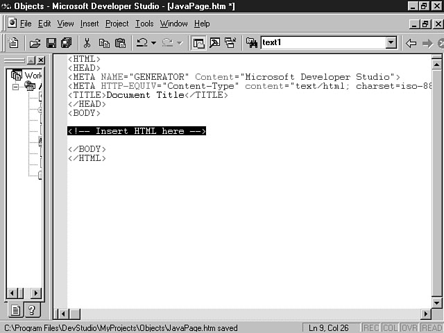
First, you need to create a new web page or choose an existing one for the Java applet. Figure 15.1 shows a newly created web page.
A sample web page.
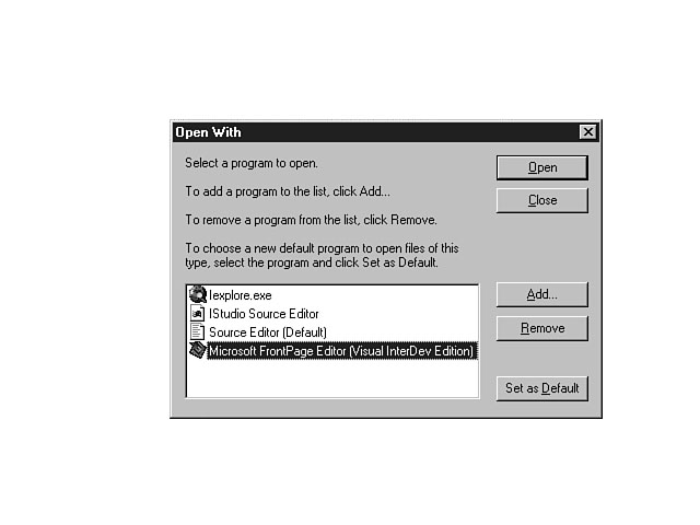
Next, you need to open the web page file, using the FrontPage Editor for Visual InterDev. As a refresher, select the HTML file in the project workspace and right-click to display the shortcut menu. Choose Open With from the list of menu items to display the list of available editors. You can then select the FrontPage Editor from the list, as shown in Figure 15.2.
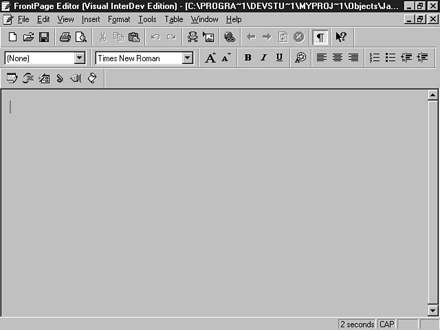
The FrontPage Editor opens so you can use it to design the web page. Figure 15.3 illustrates the sample web page as it looks in the FrontPage Editor.
Opening the file with the FrontPage Editor for Visual InterDev.
Viewing the web page through the eyes of the FrontPage Editor.
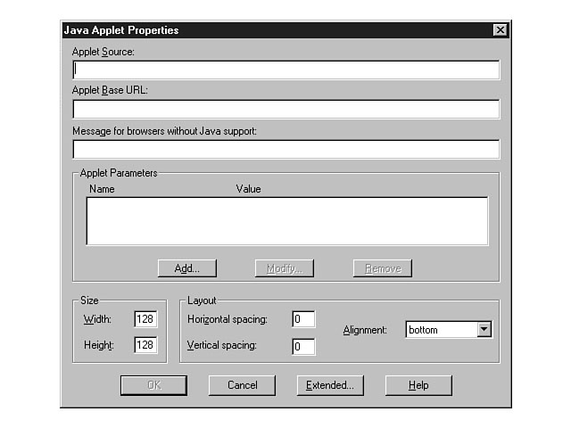
Now you're ready to insert the Java applet into the web page. To do this, choose
Other Components from the Insert menu and select Java Applet from the list. The Java
Applet Properties dialog box opens, as shown in Figure 15.4.
Figure 15.4.
Setting the properties for the applet.
NOTE: You can also click the Insert Java Applet icon on the Advanced toolbar to display the Java Applet Properties window. This icon is denoted by the letter J displayed in green.
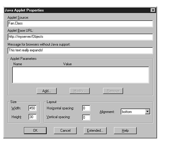
From the properties window, you can enter the name of the Java applet class and the base URL address for the applet. The name of the applet source code typically has a suffix of "class." As far as the URL address, you can provide a path to your Visual InterDev project or an address on the Internet. Figure 15.5 demonstrates an example of selecting an applet and its properties.
NOTE: This example assumes that the Fan.class file was previously added to your Visual InterDev project.
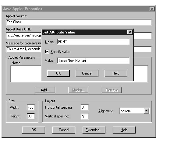
The applet in this example has text that gradually expands. You can see that the name of the applet code has been supplied, along with the Visual InterDev project path. Also, a message has been entered along with the width and height of the applet to be used for browsers that don't support Java. Once all the properties have been supplied, the final task is to specify any parameters required by the applet. You can do this by clicking the Add button in the Applet Parameters frame. You then see two entry fields where you can enter the name of the parameter and the value. Figure 15.6 demonstrates this process.
Configuring an applet for your web page.
Entering parameter values for the applet.
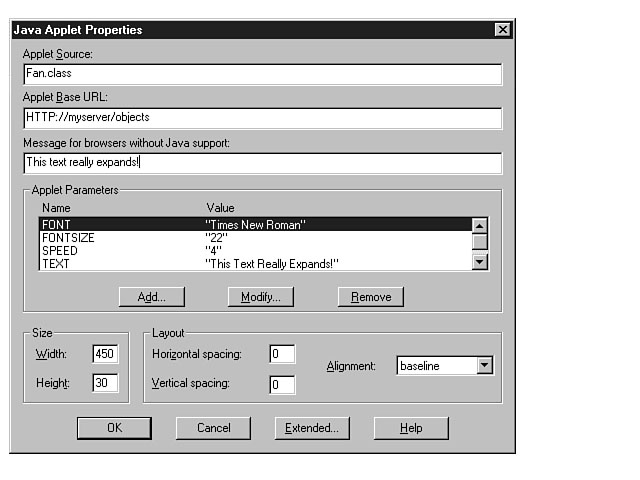
When you click OK, the name and value you enter appear in the listbox. You can repeat these steps for each additional parameter. Use the Modify button to change the value of a parameter and the Remove button to remove the parameter from the list. Figure 15.7 shows the parameters and their values for the Fan.class applet.
Confirming the parameter values.
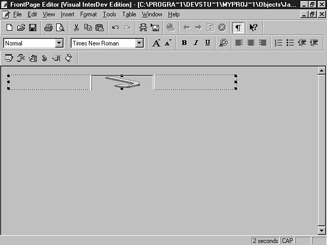
After you have confirmed the properties and parameters, click OK to insert the applet into the web page. Figure 15.8 shows how the FrontPage Editor represents Java applets in a web page.
The presence of a Java applet in a web page.
To edit the Java applet's properties, you can either double-click the applet or right-click the applet and choose Java Applet Properties from the shortcut menu. On Day 13, you learned how to use the <APPLET> tag to insert a Java applet into your web page. The FrontPage Editor improves this process by enabling you to insert the applet through a visual, user-friendly means. Instead of typing text and tags, you can supply answers and assignments and let the FrontPage Editor do the real work. Listing 15.1 contains the HTML code created by the FrontPage Editor based on this example.
Listing 15.1. Looking at the generated applet code.
<p><applet code="Fan.class" codebase="HTTP://myserver/objects"
width="450" height="30"><param name="FONT"
value="Times New Roman"><param name="FONTSIZE" value="22"><param
name="SPEED" value="4"><param name="TEXT"
value="This Text Really Expands!"><param name="VSPACING"
value="20">This text really expands!</applet></p>
Figures 15.9 through 15.11 illustrate the results of accessing this web page through Internet Explorer.
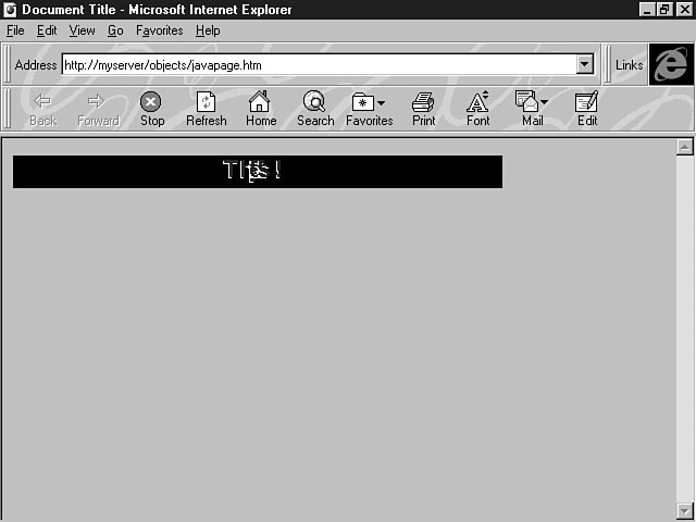
Beginning to expand.
More expansion.
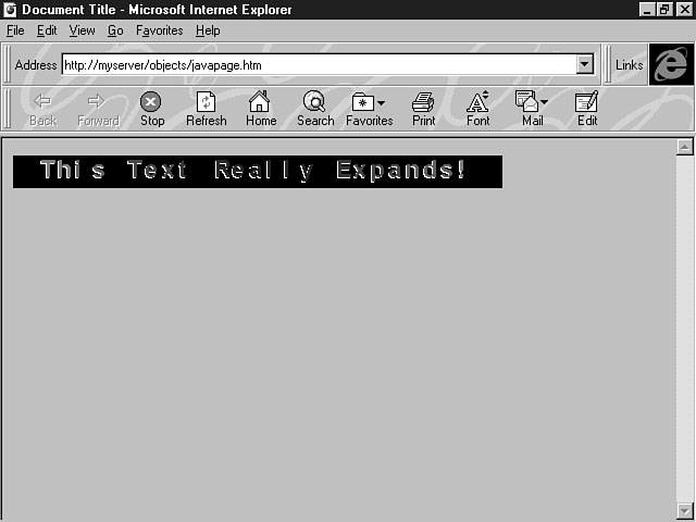
Finally, the text is displayed.
As you can tell, this process is very simple. By using the FrontPage Editor, you can rapidly integrate Java applets into your applications, which can be used to create dynamic and interactive web pages.
Integrating ActiveX Controls into Your Application
From today's lesson and the lesson on Day 13, you have discovered that ActiveX controls can enhance the look and performance of your application interface. Whether you're constructing an online entry form or publishing information about your products, ActiveX controls can make it much easier to develop an interactive application.
You had an overview of ActiveX controls during the second week, and previous lessons have explained how to insert ActiveX controls into your web pages. The rest of today's lesson explores how to integrate ActiveX controls into your applications. This lesson spends less time on the process of inserting ActiveX controls and more time on what you can do once the control has been placed in the HTML layout.
The example in this lesson shows you how to integrate several ActiveX controls to create an online order entry form for ordering book summaries electronically. The section "Customizing Properties for ActiveX Controls" explains how to extend the default values for the controls to meet the application's needs. Finally, you learn how to enhance the form's behavior with custom script in the sections "Making Objects Come Alive with Script" and "Using the Script Wizard with ActiveX Controls."
Creating an HTML Layout
So far, this lesson on ActiveX controls has focused on their strengths, benefits, and possible drawbacks. This section covers different types of ActiveX controls and teaches you how to use them in your application. The lesson gives you examples using the HTML Layout Editor as the main delivery vehicle for the layout of these controls.
You were introduced to the HTML Layout Editor during the first two weeks of lessons. The main benefit of an HTML layout is its ability to effectively handle multiple ActiveX controls. You can precisely place and position ActiveX controls in an HTML layout to design an effective user interface. The layout offers a great place for you to take full advantage of the power of ActiveX controls.
To create an HTML layout, choose New from the File menu and select HTML Layout from the list of items in the New dialog box. Enter a name for your HTML layout and click OK to create the HTML layout. The newly created layout is displayed in the HTML Layout Editor, enabling you to construct your interface with ActiveX controls.
Using Controls to Create an Order Entry Form
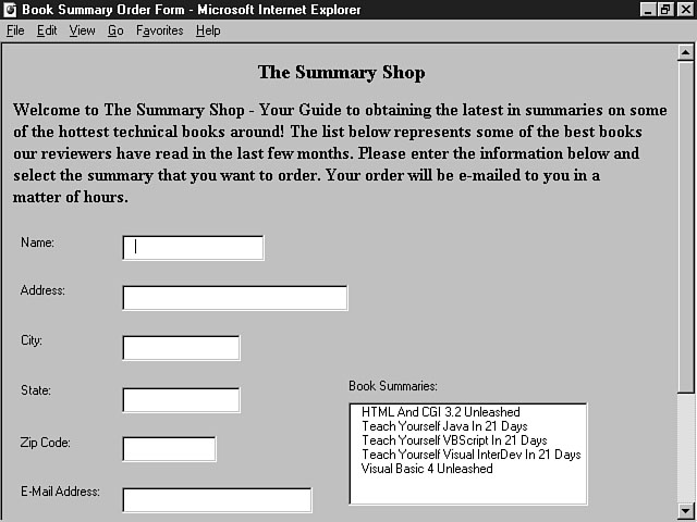
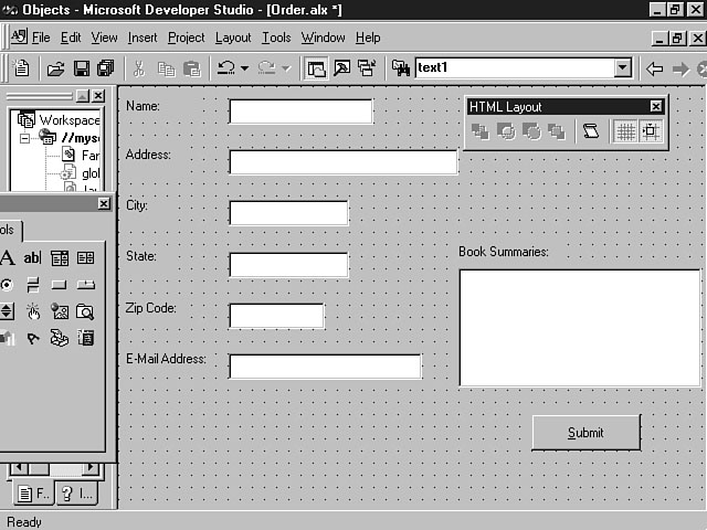
The next step is to construct the user interface using the newly created HTML layout. To give you an idea of what the end result looks like, Figure 15.12 shows the application in its final form.
The Book Summaries application.
First, the entry fields need to be created so users can enter their information. The TextBox control is similar in purpose to the HTML Text control and can be used to provide this function. You also need to identify the purpose of the fields by using the Label control. You have already learned how to combine HTML text with the HTML Text control to describe an entry field. With ActiveX, you can use the Label control, which can be used to identify the contents of the text box as well as provide extra features, such as a heading on a web page. You learned how to insert controls with the HTML Layout Editor toolbox on Day 4, "Creating Your First Visual InterDev Project." As a reminder, click the control in the HTML Layout Editor toolbox, and then move your mouse over to the control's desired position in the HTML layout. Hold down the left mouse button and drag the mouse until you get the height and width you want for the control.
TIP: You can easily insert multiple controls into an HTML layout by double-clicking the control in the toolbox. Then, you can move your mouse over to the HTML layout and click in the desired location for the control, which creates a control with a default size. You can then click to insert multiple controls of this type into the web page. When you're done inserting the controls, click the arrow key in the toolbox to go back to the default mode for editing the controls.
You can place your mouse over a tool in the toolbox to see the tooltips; they help you discover the identity of the control. Figure 15.13 shows how to discover the TextBox control with the help of tooltips.
Using tooltips to discover a control's identity.
Table 15.1 lists the controls you need for this application.
Table 15.1. ActiveX controls used in the Book Summaries application.
| Control | Quantity |
| Label | 7 |
| TextBox | 6 |
| ListBox | 1 |
| Command Button | 1 |
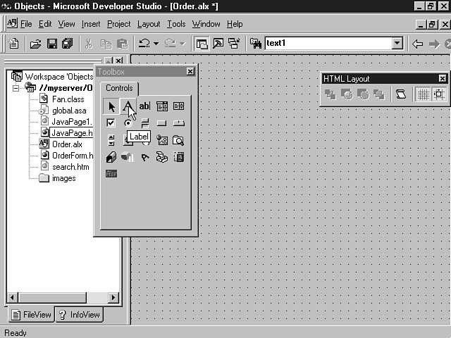
Figure 15.14 shows the layout after the ActiveX controls have been placed.
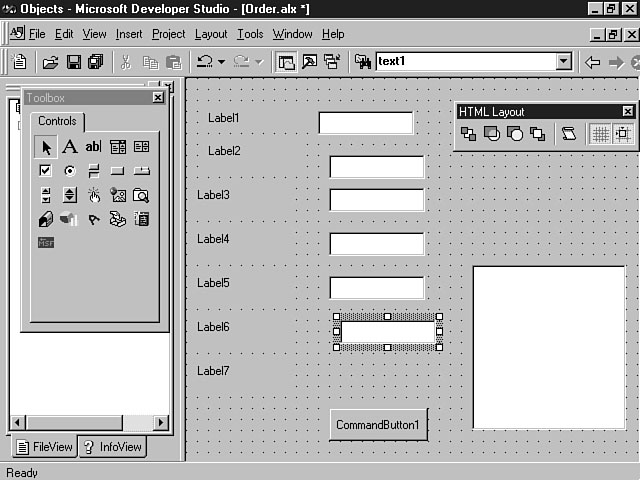
A layout with generic controls.
Notice that the controls don't resemble the controls you saw in the completed application. For instance, the labels are generically named Label1, Label2, Label3, and so on. Also, the push buttons don't have names. The next lesson demonstrates how to define the characteristics of the controls and give them identities.
Customizing Properties for ActiveX Controls
You learned about methods and properties during the first and second weeks of lessons. Properties enable you to define a control's behavior and characteristics, and methods are pre-defined procedures that enable you to perform some action that usually affects a control's behavior. In the following sections, you learn how to define the controls' properties for the Book Summaries application. The lesson entitled "Manipulating Methods to Achieve the Right Behavior" that follows this section teaches you to how to use the pre-defined methods for the controls.
Setting Properties for the Label Control
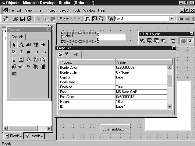
You can open the Properties window for a control by double-clicking on the control or by selecting the control, right-clicking, and choosing Properties from the control's shortcut menu. Figure 15.15 displays the Properties window for the first label control.
Setting the properties for a label.
In this window, you can customize the label's characteristics by entering a value in the blank next to the property. Most property value fields are text entry fields where you can enter text or numeric values. Some properties display a combo box when you place your cursor in the field so you can select an item from a pre-defined list of options. Other property value fields display a button with an ellipsis. When you click the button for these properties, another dialog box opens in which you can enter or choose a value for the property. For this application, the main properties that need to be changed are the ID and the caption. Table 15.2 defines the IDs and captions for all the Label controls in the layout.
Table 15.2. Label properties and their values.
| Control | Property | Value |
| Label1 | ID | lblName |
| Caption | Name: | |
| Label2 | ID | lblAddress |
| Caption | Address: | |
| Label3 | ID | lblCity |
| Caption | City: | |
| Label4 | ID | lblState |
| Caption | State: | |
| Label5 | ID | lblZip |
| Caption | Zip Code: | |
| Label6 | ID | lblEMail |
| Caption | E-Mail Address: | |
| Label7 | ID | lblSummaries |
| Caption | Book Summaries: |
As you can see from the Value column of the table, the IDs are changed to conform
to the standard naming convention for labels, which uses the "lbl" prefix.
Also, the Name properties, or captions, are changed to more descriptive
names to identify the contents of their associated text entry fields. The final design
consideration is the alignment of the Label controls. To construct an effective interface,
you need to make sure the layout is consistent and aesthetically pleasing.
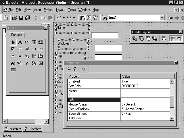
The HTML Layout Editor enables you to select multiple controls and set the property values that are common for all the controls. To align the label controls, select the lblName control and then use the Ctrl (Control) key plus the left mouse button to select the other Label controls. As you select the other controls, you will notice that the previously chosen controls remain selected. You can then display the Properties window by using one of the two methods described earlier. Figure 15.16 shows the Properties window for the Label controls.
NOTE: The example in the preceding paragraph demonstrated selecting similar controls that share the same properties. You can also select and enter property values for dissimilar controls. When you select different types of controls, the Properties window displays the properties that are shared between the controls. For example, you could select a label and a push button and set the properties that are common for both.
Align multiple controls.
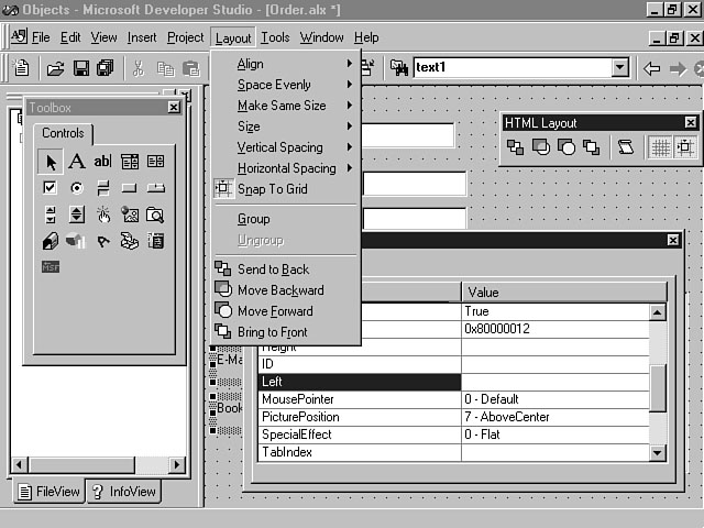
From the Properties window, you can then establish the controls' placement and alignment on the layout. Use the Left property to enter a numeric value that defines the control's placement on the layout. This value corresponds to the control's x coordinate. However, Visual InterDev has another method for aligning controls that's quicker and easier. When you open a layout with the HTML Layout Editor, a new menu--the Layout menu--is created in the Visual InterDev development environment. Use the Layout menu to perform certain functions for controls and the entire layout. Figure 15.17 shows the options available from this menu.
Using the Layout menu, you can determine the alignment, sizing, and spacing of
controls on your layout. You can also alter the layering of controls. This unique
feature of the HTML Layout Editor is useful when, for example, you want to place
radio buttons on top of a frame to organize the controls. To align multiple controls,
select all the controls and choose Align from the Layout menu. You can then choose
the proper alignment from the list of choices, as shown in Figure 15.18.
Figure 15.17.
The Layout menu's options.
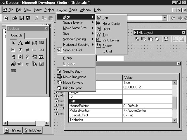
Choosing the proper alignment for your controls.
NOTE: When discussing the first method for aligning controls, I said you could directly affect the placement and alignment of the controls. In covering the second method, which uses the Layout menu, I mentioned you can affect only the alignment. The first method offers an advantage because you specify the x coordinate for all the controls. In this way, you indicate not only the alignment of the controls, but also their exact horizontal placement.
You can also choose Space Evenly from the Layout menu to equally position multiple controls on the layout. You can choose to evenly space the controls both horizontally and vertically. This feature helps facilitate logical design and order on your layout.
Setting Properties for the TextBox Control
The next step of constructing the interface is to set the properties for the TextBox controls. The main properties that need to be entered for these controls are the ID, alignment, and placement. Table 15.3 outlines the properties and values for the TextBox controls on the layout.
Table 15.3. Text box properties and their values.
| Control | Property | Value |
| TextBox1 | ID | txtName |
| TextBox2 | ID | txtAddress |
| TextBox3 | ID | txtCity |
| TextBox4 | ID | txtState |
| TextBox5 | ID | txtZip |
| TextBox6 | ID | txtEMail |
Next, the TextBox controls need to be aligned horizontally and vertically with their
respective labels.
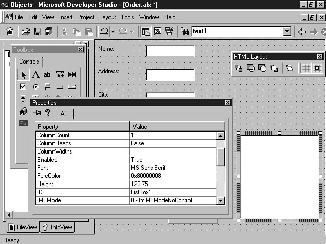
Setting Properties for the ListBox Control
You can use the ListBox control to display multiple items so the user can select an item from the list. In this application, the ListBox control is used to display the available book summaries that can be ordered. Figure 15.19 shows the ListBox control and its Properties window.
Setting the properties for the ListBox control.
As you can see, the listbox has many properties you can customize to create several different types of ListBox controls. For example, you can design the listbox to have multiple columns and column headings. A multicolumn listbox can be created to display tabular information by entering the number of columns in the ColumnCount property and changing the ColumnHeads property to True. The default style is a single column listbox, as indicated by the ColumnCount property value of 1.
NOTE: Although the ListBox control supports creating a multicolumn listbox, there are better third-party controls that support the multiple column feature. Microsoft's grid control and Farpoint Technologies' spreadsheet control are two examples of controls you can use to display and interact with multiple columns of data.
You can adjust the size of the listbox by manually changing the width and height in the Properties window, or you can select the control and drag its handles to adjust the listbox's size. The standard naming convention for the ListBox control uses the prefix of "lst." For the ListBox control in this application, the ID property is set to the value of lstSummaries.
The remaining Label control is used to describe the ListBox control, as shown in Figure 15.20.
Viewing the resulting listbox.
Setting Properties for the Push Button Control
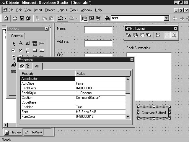
The push button, or command button, is very similar to the command button you learned about on Day 12, "Using Basic and Advanced HTML Form Controls." You can define the size, caption, and font properties, among others, for the push button control. This button is used by the application to submit the order for the book summary. Figure 15.21 displays the Properties window for the command button.
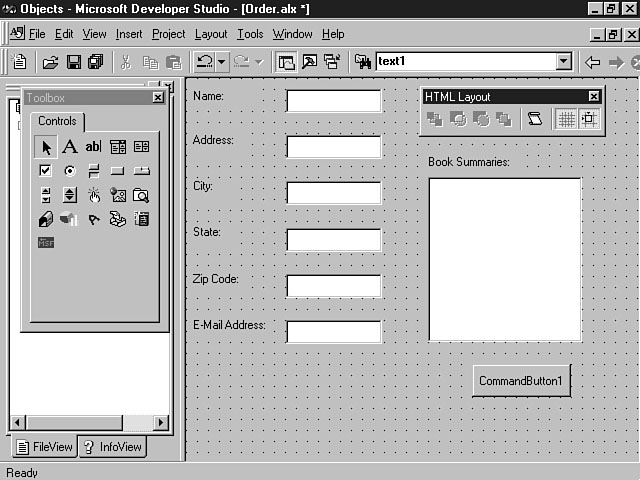
The ID for this control uses the "cmd" prefix and is named cmdSubmit. The Caption property has also been changed to the value of Submit. Figure 15.22 shows the user interface that's created, based on the controls and properties set so far.
TIP: It's a good idea to supply accelerator keys for push buttons used in your layout. Accelerator keys offer quick keyboard access to activate controls in the application. Notice in Figure 15.22 that the letter S on the push button is underlined, meaning that S is the accelerator key for the Submit push button. You can use the accelerator key for this control by pressing the Alt+S key combination. To create an accelerator key, enter the letter in the Accelerator property found in the control's Properties window.
Setting the properties for the push button control.
The Book Summaries user interface.
Manipulating Methods to Achieve the Right Behavior
A method is a pre-defined procedure you can call to execute a specific function on or by your control. Each control consists of associated methods inherent to the control that you can use in your application. The method contains prepackaged code that enables you to extend the control's power. Methods also save precious development time because you don't have to custom-develop the code carried out by the method.
This is the syntax for calling a control's method:
ControlID.MethodName
In this code line, ControlID is the ID for the control and MethodName is the name of the method you're calling. For example, one of the methods for the push button control is Click. The following line of code demonstrates how to call this method for a push button called cmdSubmit:
cmdSubmit.Click
If an application executes the Click method, the Click event is triggered, executing any code in the procedure for that event. Remember, the Click event is typically initiated by the user. For example, the user can activate the Click event by clicking a push button. This example demonstrates how you can use a pre-defined method for the push button control to simulate the same behavior in your application code.
NOTE: The purpose of this part of the lesson is to teach you how to use methods in your application, but it's beyond the scope of this lesson to cover each and every method for all the different types of controls. You will, however, learn the purpose and basic concepts of using methods that you can apply to any control you integrate into your application. After you understand these concepts, you can research the product documentation for the ActiveX controls you're using to learn about their explicit methods.
Mastering Methods for Your Controls
So far, the lesson has explained how to construct a basic user interface for the Book Summaries application by using an HTML layout and ActiveX controls. In this section, you learn how to use some of the methods associated with the controls to create intelligent logic for your application.
The purpose of the Book Summaries application is to let users order a book summary, using an inventory list of available summaries. You might have noticed that although the basic ListBox control has been constructed, there are no items in the list. The ListBox control has a pre-defined method called AddItem that you can use to populate its contents. This is the syntax for the AddItem method:
ListBoxControlID.AddItem Item |varIndex
ListBoxControlID is the ID, or name, of the control, Item is the information to be added to a row in the listbox, and varIndex specifies the row in the listbox to add the data. Both the Item and varIndex attributes are optional. You can enter a variable or a value enclosed in quotes for the Item attribute. If you don't specify a value for varIndex, the item is added to the last row of the listbox. The varIndex attribute for the beginning row of the listbox has a value of 0.
NOTE: You can't assign a value to varIndex that's greater than the number of rows in the listbox. For example, if the listbox has ten rows, specifying a value of 11 for varIndex would cause an error.
Listing 15.2 gives you the code used by the Book Summaries application to fill the contents of the listbox.
Listing 15.2. Populating the items in the listbox.
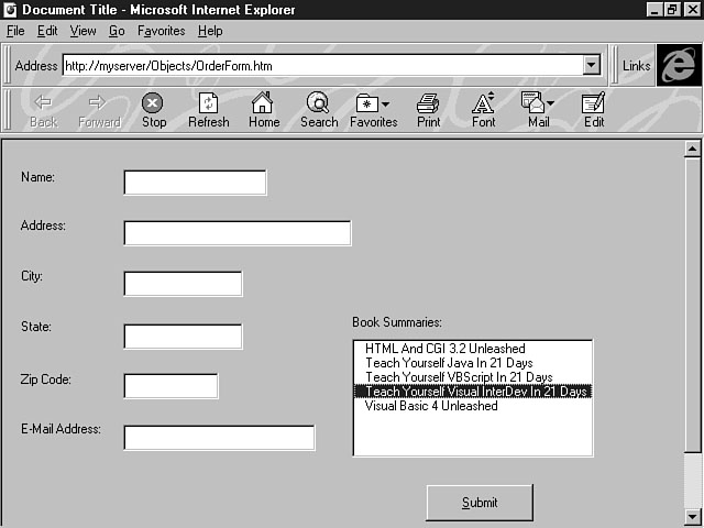
Sub Layout1_OnLoad ()
lstSummaries.AddItem "HTML And CGI 3.2 Unleashed"
lstSummaries.AddItem "Teach Yourself Java In 21 Days"
lstSummaries.AddItem "Teach Yourself VBScript In 21 Days"
lstSummaries.AddItem "Teach Yourself Visual InterDev In 21 Days"
lstSummaries.AddItem "Visual Basic 4 Unleashed"
End Sub
This code example is placed within the procedure that executes when the layout is initially loaded. In this way, the user sees a list of items when the application opens, as shown in Figure 15.23.
Giving the user choices.
In this example, an item is highlighted when the user selects a particular book summary in the list. The listbox has been defined with the default values of Single and Plain for the MultiSelect and ListStyle properties, respectively. The MultiSelect property indicates whether the user can select multiple items from the list. Its default value of Single specifies that only one selection can be made at a time, but you can let the user select multiple items in the list by entering a value of Multi for the MultiSelect property.
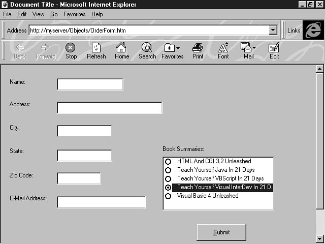
By using the ListStyle property, you can place an option indicator next to the items in the list. Plain, the default value for this property, specifies that the items are displayed in the list without a visual indicator to their left. If you enter the value of Option for the ListStyle property, an indicator appears next to the items in the list. What this indicator looks like depends on the value you enter for the MultiSelect property. If the control is defined as a single-selection listbox, the indicator is a circle placed to the left of the items. When a user selects an item, a dark round circle, similar to a radio button, is placed next to the item, which is also highlighted, as shown in Figure 15.24.
Using an indicator for a single selection.
If you have entered a value of Multi for the MultiSelect property, however, the indicator is a checkbox. This indicator, which is placed to the left of the selected items, means you can select multiple items in the list. The checkmark indicator is shown in Figure 15.25.
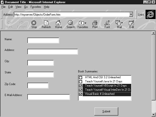
Using an indicator for multiple selections.
NOTE: You could also create an Active Server Page that creates the web page and HTML layout and populates the contents of the listbox from rows in a database table.
Making Objects Come Alive with Script
Now that the HTML layout has been given a designated form, scripting code must be add-ed to give the layout its function. As you have learned over the past two weeks, you can add scripting logic to both the client and server to meet your application's needs. Client-side logic can be used to provide user input validation and respond to user-initiated events. With Active Server Pages, you can extend the power of script code to the server to construct dynamic, interactive web pages. You can develop Active Server Pages that not only construct the user interface, including the web page and HTML layout, but also offer database and server interaction for your application.
Associating Script Logic with Your Controls
For purposes of this application, client-side script is used to validate the user input and to display a confirmation message to the user once the order has been placed. When you place an ActiveX control directly in a web page, you can also enter the client-side script in that file. When you use an HTML layout in your web page, the client-side script is associated with the actual HTML layout, or ALX, file. This means you need to use the HTML Layout Editor to actually view the code instead of seeing the script in the HTML web page file. The code still executes in the layout contained in the web page.
Using the Script Wizard with ActiveX Controls
So far, you have learned how to construct a user interface by using an HTML layout and ActiveX controls, design the characteristics and behavior of the controls by adjusting their properties, and affect the control's behavior by manipulating control-specific methods. The final lesson for the day teaches you how to add more functions and features to the application by using client-side script. The Script Wizard gives you a visual helper to implement scripting logic for your application. You can use the power of the Script Wizard to develop routine script logic through a point-and-click interface and then customize the generated code.
Reviewing the Script Wizard
For the purposes of the Book Summaries application, client-side script needs to be added to supply user entry validation and the code to display a confirmation message to the user. As you learned on Day 4, you can activate the Script Wizard by selecting a specific control or the layout and right-clicking to open the shortcut menu. Next, choose Script Wizard from the list of menu items, as shown in Figure 15.26.
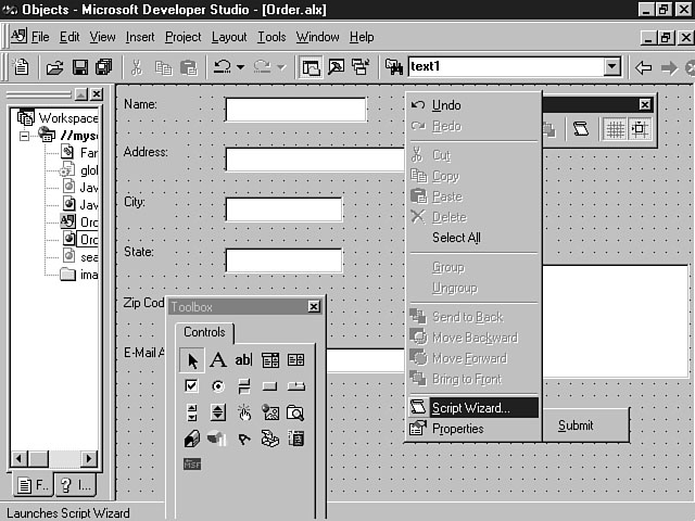
Seeking help from the Script Wizard.
Figure 15.27 shows the options for the HTML layout, using the Script Wizard.
The List View displays the controls, events, and actions for the order form layout. You probably recall from the first week that the List View enables you to create the script code for your application by selecting the options and actions for the controls. The Code View enables you to manually enter the script logic for the controls and their actions.
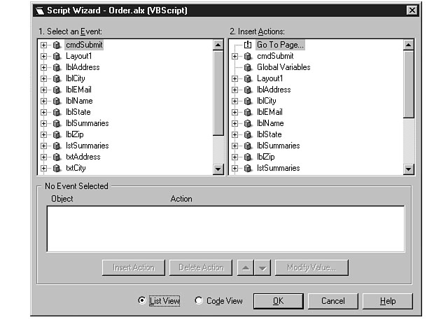
The List View of the Script Wizard.
Adding the Finishing Touch to the Application
In this section, you use the Code View to add the scripting logic for this application. You can open this view by clicking on the Code View radio button at the bottom of the Script Wizard dialog box. Several functions need to be added to the Book Summaries application. First, the E-Mail Address field needs to be validated to make sure the user enters a valid address. Second, the application needs to verify that information has been entered for all of the fields and that an item has been selected from the list before the push button can be clicked for the user to submit the order. Finally, scripting logic needs to be added to display a confirmation message when the user clicks the Submit push button. Listing 15.3 displays the code for the Submit push button's Click event.
Listing 15.3. Validating the e-mail address.
Sub cmdSubmit_Click ()
If (InStr(EMail, "@") = 0) Then
MsgBox "Please enter an email address in the form username@location."
Else
MsgBox "Thanks! Your order will be sent to you shortly."
End If
End Sub
This code validates the information entered for the E-Mail Address field and displays a message if the address doesn't have an @ symbol. To enter this code using the Script Wizard, click the plus sign to the left of cmdSubmit in the Script Wizard's Event pane to expand the events for the Submit push button. Next, select Click to display the procedure for the Click event in the Script pane. You can then enter the script code in Listing 15.3 for the subprocedure. Listing 15.4 shows the individual procedure code to validate that all the order entry fields have been entered.
Listing 15.4. Making sure the fields are entered.
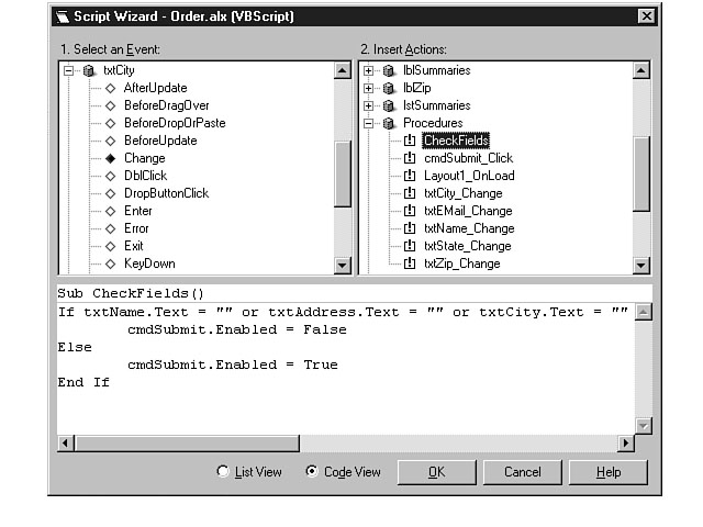
Sub Layout1_OnLoad()
cmdSubmit.Enabled = False
End Sub
Sub txtName_Change()
call CheckFields()
End Sub
Sub txtAddress_Change()
Call CheckFields()
End Sub
Sub txtCity_Change()
Call CheckFields()
End Sub
Sub txtState_Change()
Call CheckFields()
End Sub
Sub txtZip_Change()
Call CheckFields()
End Sub
Sub txtEMail_Change()
Call CheckFields()
End Sub
Sub lstSummaries_Change()
Call CheckFields()
End Sub
Sub CheckFields()
If txtName.Text = "" or txtAddress.Text = "" or txtCity.Text = ""
or txtState.Text = "" or txtZip.Text = "" or
txtEMail.Text = "" or lstSummaries.Value = "" Then
cmdSubmit.Enabled = False
Else
cmdSubmit.Enabled = True
End If
End Sub
These procedures are interspersed throughout the individual events for the controls. You can add the code for specific events in the same manner that the code for the Submit push button code was added. For example, to enter the code for the txtName field's Change event, click Change in the Script Wizard's Event pane. You can then add your script for the event procedure in the Script pane. The last procedure in this code listing is a common procedure found in the Procedures section of the Action pane. You can create a common procedure to be used throughout your code by selecting Procedures in the Script Wizard's Action pane and right-clicking to display the shortcut menu. Figure 15.28 demonstrates how to create a new common procedure for your code.
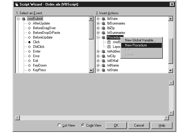
Creating a new procedure.
After you choose New Procedure from the shortcut menu, a subprocedure template is created in the Script pane in which you can supply the name and scripting logic. Figure 15.29 shows the CheckFields subprocedure in the Script Wizard's Code View.
After you have entered all the scripting logic for the individual procedures, you're ready to run the application, as shown in Figure 15.30.
In this example, the user ordered a summary for a really good book!
A sample procedure.
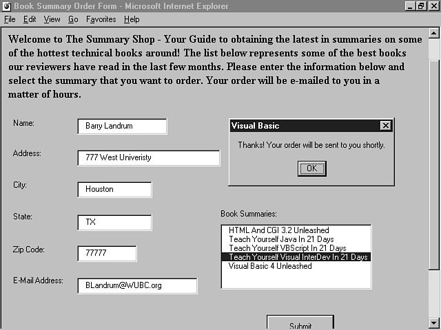
Ordering the book summary.
Summary
The Book Summaries application demonstrates how to integrate ActiveX controls into your application. Today's lesson has focused on building an application with the power of ActiveX controls. You should now understand the basic concepts and steps for developing an HTML layout, integrating specific ActiveX controls to construct the interface, and using control methods and script to extend the power of these controls. You should also understand how to integrate and use a Java applet to construct a dynamic application. Although the debate will continue to rage over Java and ActiveX, the central premise of this lesson is that you should use both of these robust objects in your application as complementary technologies.
The first part of today's lesson outlined the basic strengths, differences, and weaknesses of ActiveX controls and Java applets. Next, you learned how to use Visual InterDev to integrate a Java applet into your Web-based application. The lesson also gave you an overview of creating an HTML layout and inserting ActiveX controls into your web pages. The Book Summaries application is a good example of how to build an application based on ActiveX controls. The lesson guided you through inserting and positioning basic ActiveX controls into your layout and manipulating controls' properties and methods to get the behavior you want for your interface. Finally, you learned how to extend the reach of your controls by using client-side script.
Now that you have finished today's lesson, you should have a thorough understanding of building the front-end of a Web-based application. This knowledge, combined with your comprehension of server topics, such as database integration and Active Server Pages, learned during the second week, will enable you to use Visual InterDev to create a "killer" application for the Web.
Q&A
- Q With security concerns on the rise and the potential risks of using objects,
should I use Java applets and ActiveX controls in my web pages?
A Both Java and ActiveX have tried to define tight security standards for the implementation and use of objects. Moreover, browsers from Netscape and Microsoft have also implemented security controls for downloading these controls and objects. Finally, third-party vendors are building software to specifically monitor the activities of Java applets and ActiveX controls. One such company is Finjan Software, Ltd., who has developed a software product called SurfinGate that helps to keep these objects in check. This product is representative of some of the newer products being developed to further protect your Internet and intranet applications from the activity of rogue objects. The SurfinGate software analyzes and verifies the safety of Java applets and ActiveX controls and then provides a digital certificate of authenticity. Based on these safety measures, you should feel confident and secure about using ActiveX controls and Java applets in your Web-based applications. Remember, use only those objects and controls that have been digitally signed and authenticated.
Q What tools are available to build Java applets?
AMany tools already exist, or are being developed, to help you create Java applets and applications. Some of the more popular tools are Microsoft Visual J++ and Symantec Visual Café. If you're thinking of building your own custom Java applet, you should seriously consider Visual J++ because of its strong integration with Visual InterDev. The Developer Studio shell enables you to simultaneously open Visual J++ and Visual InterDev projects, reducing your development time and making it easier to integrate applets into your Web-based applications.
Q What tools can I use to develop ActiveX controls
AYou have several options for developing ActiveX controls, including Microsoft Visual C++, Visual Basic, and Borland Delphi. You will learn how to build ActiveX controls by using the Visual Basic Control Creation Edition during tomorrow's lesson.
Workshop
During today's workshop, you get a chance to extend the functionality of the Book Summaries application. You're going to use an ASP to create the HTML layout on a web page and populate the contents of the listbox from a database table. Feel free to use the layout, controls, code, and examples presented in the lesson. You can find them on the CD-ROM included with this book. You can choose to create a table using your database of choice to contain book summaries, or you can use an existing table in your database to present some other type of information. You need to change the application's functionality to match the information you decide to present. The goal of this workshop is to teach you how to integrate client and server components to build a robust application.
Quiz
- 1. What is a method?
2 What method do you use to add items to a listbox?
3.What property enables you to define the text for the label control?
4.What exciting Visual InterDev feature automatically generates script code based on your input?
Quiz Answers
- 1. A method is a pre-defined procedure associated with a control that
performs a specific action to affect its behavior. You can use a control's method
to further change its behavior and characteristics in your application.
2 Use the AddItem method to add items to a listbox.
3 The Caption property is used to set the text for the label control.
4.The Script Wizard enables you to visually choose controls, actions, and events to automatically generate script code for your application.